Visual Identity
Logos
From the very beginning, we have always been inspired by the journey. It was always more than an 'e.' It is a perfect metaphor for the journey of our business - both where we've come from, but more importantly, where we are going. After three generations of leadership we are re-introducing this iconic logo, in a modern holistic brand system. It is a visual mechanic to frame what we’re most proud of, reflect the environments of our customers, and our 90,000+ strong team. Reintroduced, refined, and a reminder that we’re not ones to rest on legacy, but we use it to propel us to the future.
Our Mark is inspired by the strength of our heritage, and the iconic dual parallel lines from the original Enterprise Leasing logo. The visual language of the original ‘e’ serves as a metaphor for the road ahead, or ‘the journey’. This honors our legacy while driving clear forward momentum.
If you have a need for a logo file, please email brand@em.com.
Primary Logo
The Primary Logo is the logo that should be used most commonly. It should be the first choice for all logo applications.
Secondary Logo
The Secondary Logo is our vertical format logo. We use this logo in instances when the layout is portrait, square or very narrow. Color Usage and the Safety Area on the Secondary Logo follows the same convention as our Primary Logo.

Program, Product and Department Logos
In certain situations the development of a program, product or department logo may be appropriate. If you think you may have a use case that warrants a logo, please contact brand@em.com. You should never create a logo on your own.
Don’ts – Mark and Logo Practices to Avoid
Colors
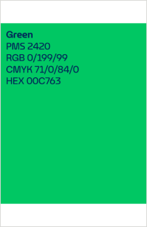
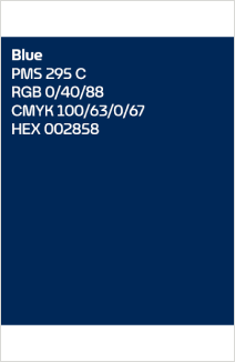
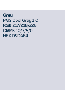
Primary Color Palette
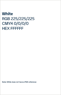
Our color palette distinguishes us as Enterprise Mobility. Together, our colors help create a recognizable, confident and consistent visual identity.
Typography
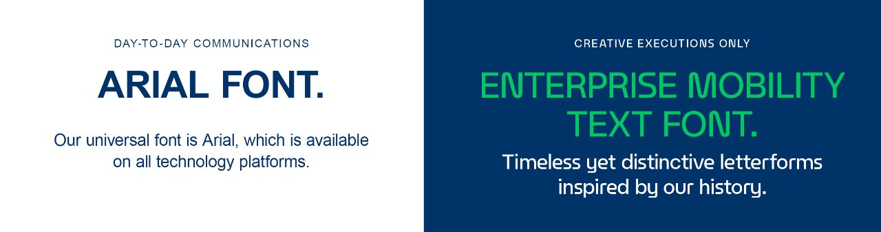
We have two primary fonts for Enterprise Mobility. Our font for day-to-day communications is Arial. This font is available on all tech platforms. As you compose emails, content for Word documents, presentations in PowerPoint and more, please ensure that you are using the Arial font.
For creative executions, we have a custom Enterprise Mobility Text Font. You will see this font across key brand and marketing elements. Access to this font is limited to Marketing and Communications. If you have a need for creative support leveraging this font, please contact brand@em.com.